Mastering Mobile-Friendliness: Responsive Design, Mobile Search Optimization, and AMP

Mobile devices are becoming increasingly popular for internet browsing, so it’s more important than ever to ensure that your website is mobile-friendly. With so many different devices and screen sizes, creating a website that works well on all of them can be challenging. However, by mastering mobile-friendliness, you can ensure that your website provides a great user experience for all of your mobile visitors.
What is a Mobile-friendly website?
Mobile-friendly refers to the degree to which a website is optimized for viewing and usability on mobile devices such as smartphones and tablets. A mobile-friendly website is designed to be easily accessible and readable on smaller screens, with user-friendly navigation and clear content presentation.

Mobile-friendly has become increasingly important in recent years, as mobile device usage has overtaken desktop usage for internet browsing. Websites that are not mobile-friendly can be difficult to navigate on mobile devices, resulting in a poor user experience and high bounce rates.
In addition, search engines like Google prioritize mobile-friendly websites in their search results, meaning mobile-friendliness can impact a website’s search engine optimization (SEO) and overall visibility online.
Here are some tips for mastering mobile-friendliness:
Use Responsive Design
Responsive design is a technique for creating websites that automatically adjust to the screen size of the device used to view it. As a result, your website will look great on desktops, tablets, and smartphones. In addition, a responsive design can help improve the user experience for your mobile visitors by ensuring that your website is easy to use and navigate on smaller screens.
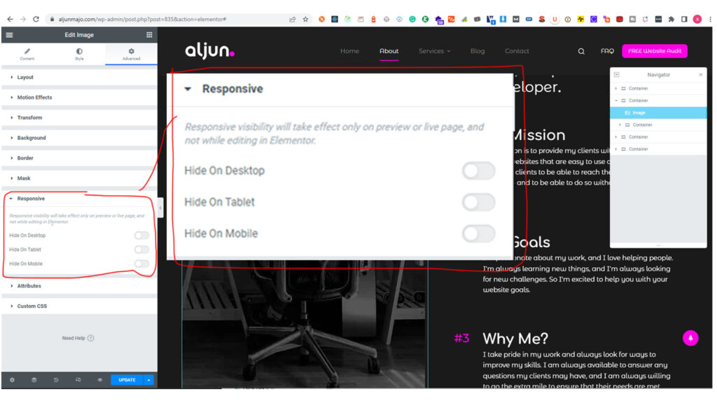
Using Frontend CSS Frameworks can help. One of my favorites is Bootstrap CSS Frameworks.
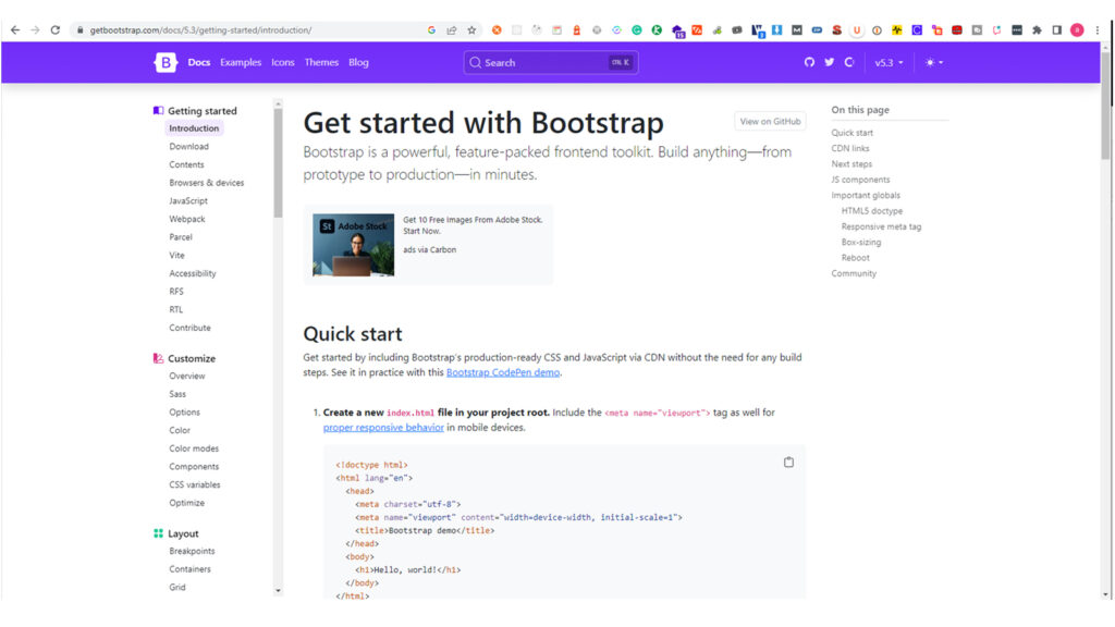
Bootstrap is a popular CSS framework widely used for creating responsive websites. Responsive design is designing websites that adapt to different screen sizes and devices. Bootstrap is important in responsive design because it provides a comprehensive set of pre-built CSS classes and components that make it easier to create responsive websites. In addition, its pre-built responsive grid system, customizable styles and components, cross-browser compatibility, mobile-first approach, and active development and support make it a popular choice among developers for creating responsive websites.
Optimize for Mobile Search
In recent years, mobile devices have surpassed desktops as the primary means of accessing the internet. As a result, optimizing for mobile search has become a critical aspect of digital marketing. With the increasing use of smartphones and other mobile devices, businesses need to ensure that their websites are mobile-friendly and optimized for mobile search.
One of the most important aspects of optimizing for mobile search is ensuring that your website is mobile-friendly. This means designing your website to be responsive to different screen sizes and orientations and ensuring that it loads quickly and is easy to navigate on mobile devices. A mobile-friendly website not only improves user experience but also helps improve your website’s mobile search ranking.
Another important aspect of optimizing mobile search is optimizing your content for mobile users. This means ensuring that your content is easy to read and navigate on a small screen, using shorter paragraphs and larger font sizes, and using mobile-friendly images and videos. Optimizing your content for mobile users can improve user experience and engagement, which can help improve your website’s mobile search ranking.
Finally, improving your website’s mobile search ranking involves a range of tactics, including optimizing for local search, using mobile-specific keywords, and improving your website’s mobile page speed. By improving your website’s mobile search ranking, you can attract more traffic, improve user experience, and increase conversions.
Use Accelerated Mobile Pages (AMP)
Accelerated Mobile Pages (AMP) is an open-source project launched by Google in 2015 that aims to improve the mobile browsing experience by reducing page load times and improving website performance on mobile devices. AMP aims to provide a fast, seamless, and user-friendly mobile experience for users by enabling web pages to load quickly and smoothly.
The need for AMP arose because many mobile users experience slow page load times, particularly on slow internet connections or older mobile devices. Slow page load times can lead to frustration and a poor user experience, ultimately leading to lower business engagement and conversions. AMP was designed to address this issue by enabling websites to create lightweight, stripped-down versions of their pages that load quickly and efficiently on mobile devices.
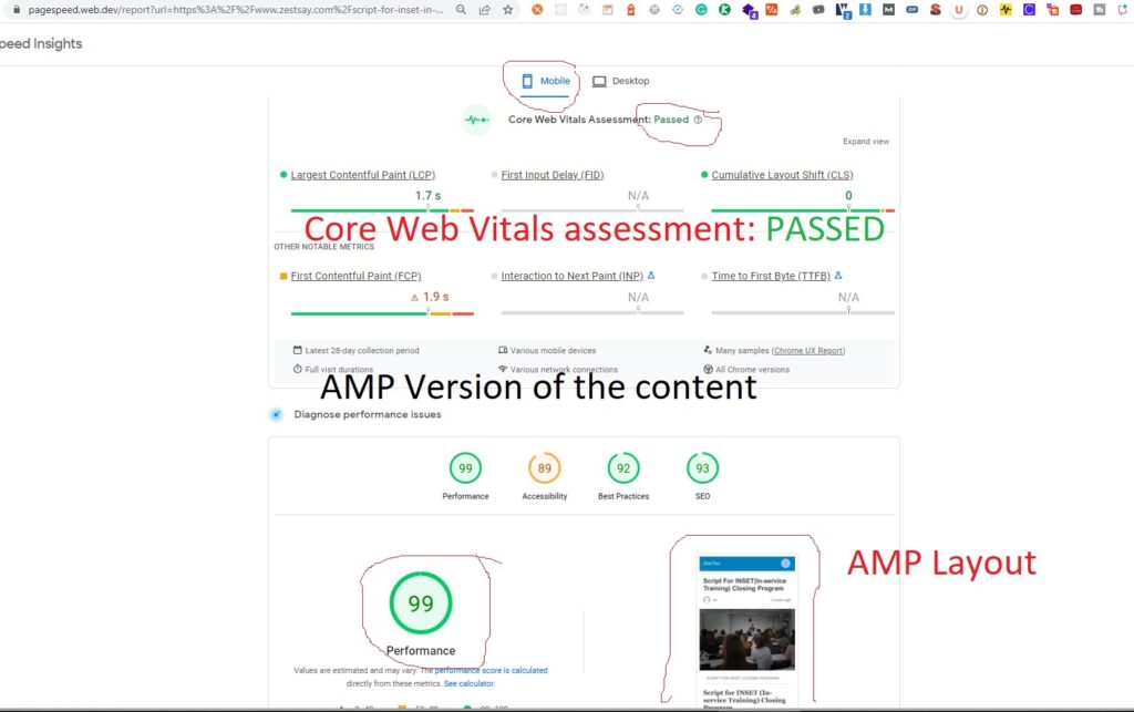
The AMP framework consists of three main components: HTML, JavaScript, and Cache. AMP HTML is a simplified version of standard HTML optimized for mobile device performance. AMP JavaScript is a subset of standard JavaScript designed to be more efficient and load faster. Finally, AMP Cache is a content delivery network that stores and delivers AMP pages quickly and efficiently.
By using AMP, businesses can improve their website’s mobile performance and user experience, leading to increased engagement, better SEO rankings, and, ultimately, more conversions and revenue. AMP can also help businesses stay competitive in an increasingly mobile-first digital landscape by ensuring that their websites are optimized for mobile devices and providing a seamless user experience across all devices.
Accelerated Mobile Pages (AMP) WordPress plugin
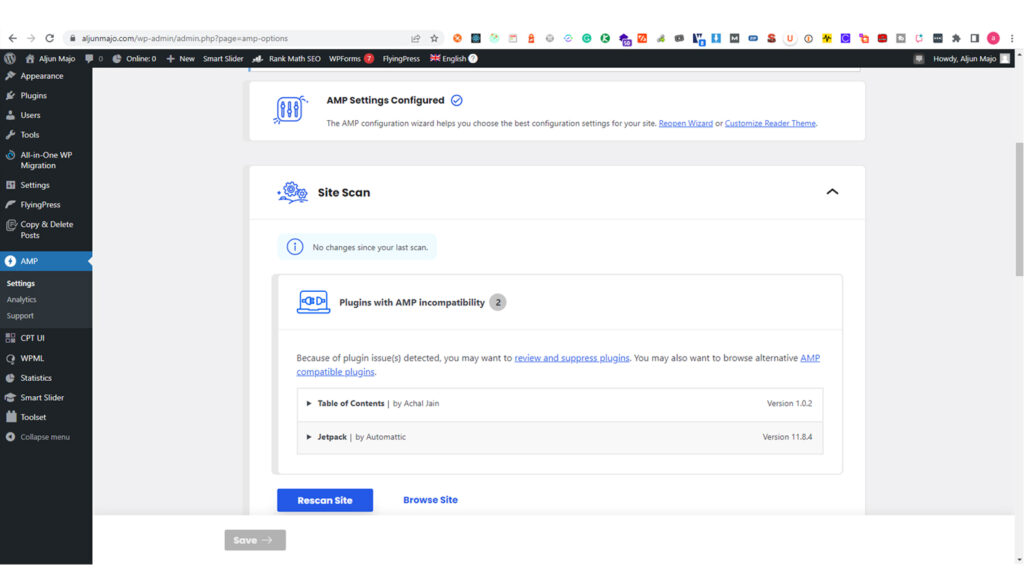
The Accelerated Mobile Pages (AMP) WordPress plugin is an easy and effective way to implement AMP on your WordPress website. With the plugin, you can create AMP versions of your website pages and posts that are optimized for mobile devices and load quickly.
The AMP WordPress plugin includes several features that make it easy to use, such as built-in support for Google Analytics and AdSense and a customizable design template that allows you to create AMP pages that match your brand.
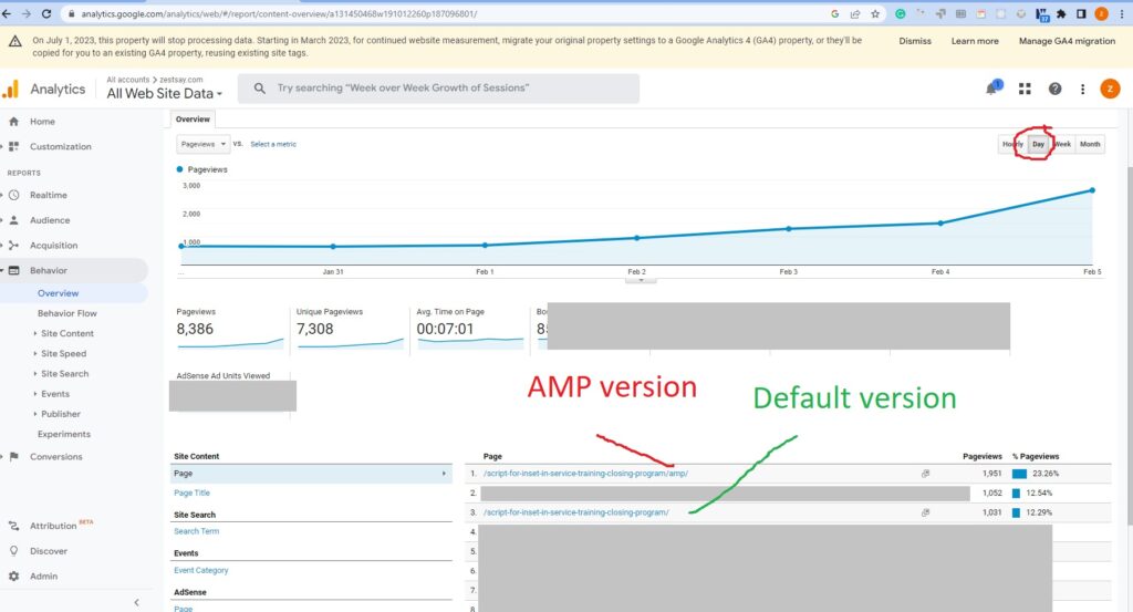
The AMP WordPress plugin can help improve your website’s mobile performance and user experience, leading to increased engagement and conversions. Additionally, since AMP pages are often prioritized in mobile search results, implementing AMP can also help improve your website’s mobile search visibility and attract more traffic to your site.
Overall, if you have a WordPress website and want to improve its mobile performance and user experience, using the AMP WordPress plugin is a simple and effective way to achieve this goal.
Simplify Navigation
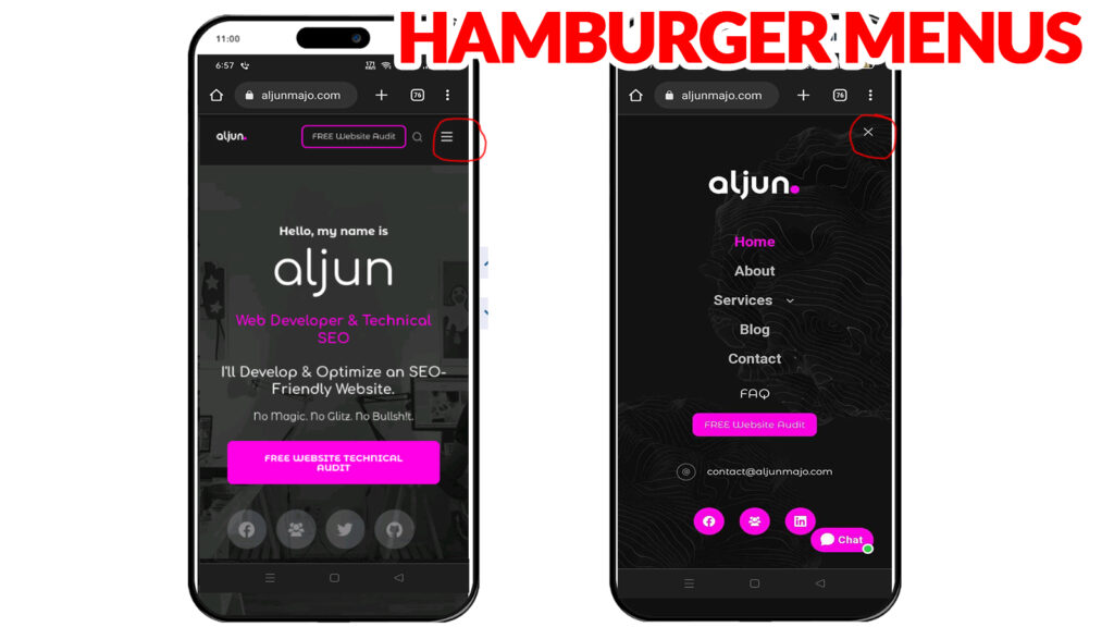
Simplifying your website’s navigation is essential for mobile-friendliness. This means using drop-down menus or hamburger menus to keep your navigation menu compact and easy to use on smaller screens. It also means ensuring that your website’s content is easy to find and navigate on a mobile device.
Optimize Images and Videos
Optimizing images and videos is an important aspect of mobile optimization. Large, high-resolution images and videos can slow down your website’s load time, negatively impacting your mobile user experience.
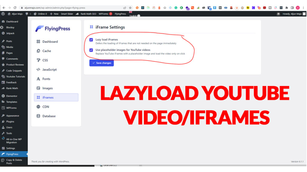
To optimize your images and videos, you can use compression tools or plugins that reduce the file size without sacrificing quality. Additionally, you can display smaller versions of images on mobile devices or use lazy loading to delay the loading of images until they are needed.
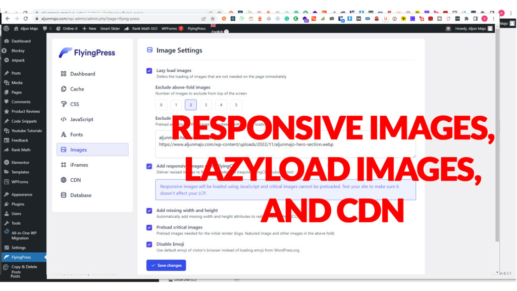
Optimizing images and videos improves your website’s mobile performance and helps conserve mobile data usage for your visitors. By optimizing your media content, you can provide a faster and more efficient mobile experience for your users.
Use Mobile-Specific CTAs
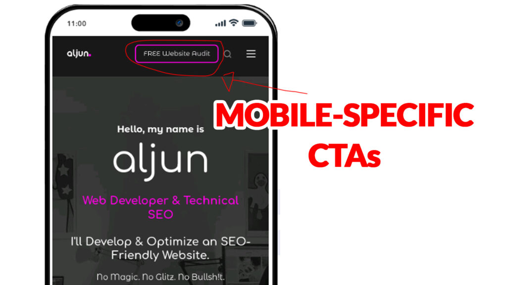
Mobile-specific calls-to-action (CTAs) are essential for improving the user experience for your mobile visitors. This means using CTAs designed specifically for mobile devices, such as “Call Now” or “Get Directions.” Using mobile-specific CTAs can help to improve engagement and conversions for your business.
In conclusion, mastering mobile-friendliness is essential to provide a great user experience for your mobile visitors. By using responsive design, optimizing for mobile search, using AMP, simplifying navigation, optimizing images and videos, and using mobile-specific CTAs, you can ensure that your website is mobile-friendly and provides a great user experience for all of your mobile visitors

